We’re back for another installment of The Story of a Poster! Once again, we started by looking at several things:
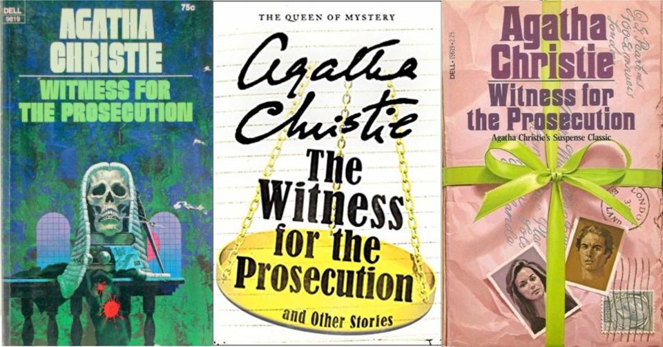
- a) what other posters for the show looked like, especially recent productions; as well as jackets of editions of the book through the years.
- b) what the original art looked like; and
- c) what images from the script would make a strong poster.
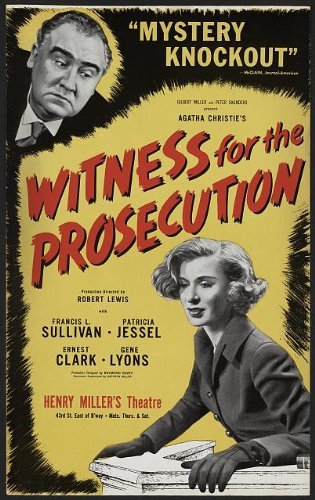
In the answer to a): we decided to not do the most common images on other people’s posters: scales of justice, gavels, courtroom imagery of a woman on the witness stand.
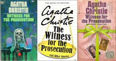
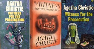
We also took a look at book jackets (from the short story collection that contains Christie’s original story that she adapted for the stage). It was weird to see images on paperback book covers that have nothing to do with anything that happens in the story or the play!
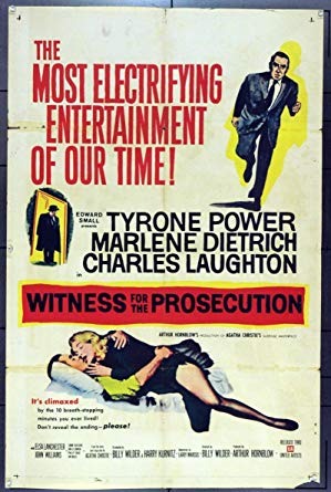
And the art from the famous Billy Wilder 1957 film was no help—it shows a flashback scene and Tyrone Power in a clinch with Marlene Dietrich.
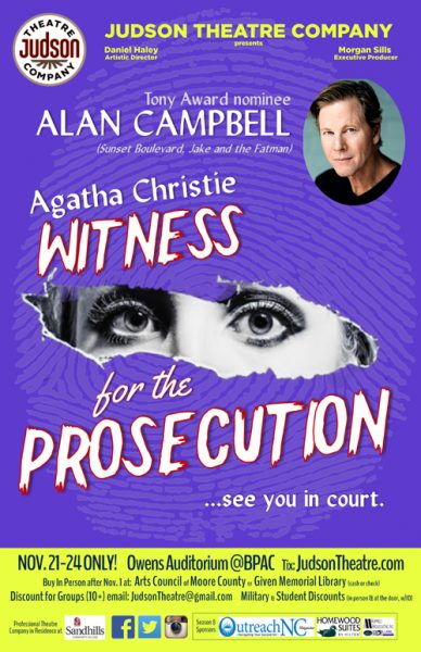
On, then, to b) what the original Broadway art, and our first bolt of inspiration: the font! We found something similar, and that’s our nod to the original production. We made it our own by outlining it in blood red (alluding to the murder at the heart of the play), and using a different period font for the words “for the” in the title.
And then c): the peering female eyes through the torn page reinforce the “witness” in the title. The fingerprint is another reference back to the play but also gives the poster texture.
We went with an eye-catching saturated bright ultramarine as the principal color, and went for sharp contrast with a chartreuse that leans toward green for the secondary color, which makes the blue lettering against it clear and easy to read.
Put all these things together and that’s The Story of a Poster.
Click here to get your tickets now for Witness for the Prosecution!