Our popular blog feature “The Story of a Poster” returns!
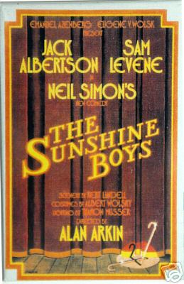
Original Broadway Windowcard, 1972
As with HARVEY, we referred back to the original Broadway art for inspiration. But we changed it up and added to it to make it our own. We always take a look at what other designers have envisioned for the show—we don’t want to miss anything–but this time came up dry.
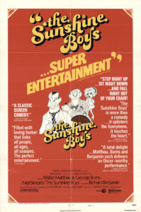
Film quote poster, 1975
The film’s art was very 1970s and centered completely on review quotes. It uses a Hirschfeld of Walter Matthau and George Burns, so we couldn’t really use anything like that and didn’t want to create an imitation Hirschfeld!
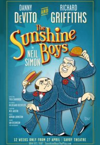
London Revival Windowcard, 2012
We felt like we didn’t want to go in the same direction as the artwork for the 90s Broadway revival or the recent West End/LA production.
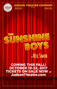
Poster Teaser March 2017
It all began back in March, when the first task was to come up with a teaser poster in a hurry to display in the lobby during AND THEN THERE WERE NONE. We hadn’t cast our stars at this point, so all we had was the title, the author, and the dates. So: curtain, spotlight, frame.
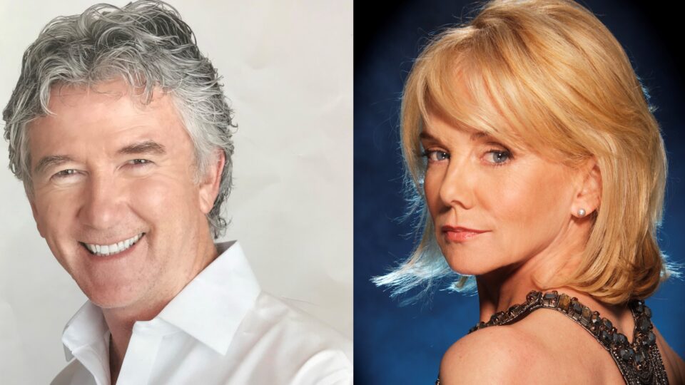
THE SUNSHINE BOYS has a long history as a vehicle for a pair of stars, so once we knew that Don Most (from Happy Days and Glee) and Robert Wuhl (from Arli$$ and Bull Durham) would be joining us, we added them to the artwork, with much larger star photos than we usually use, to emphasize the presence of our star team.
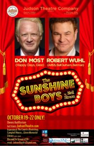
Sunshine Boys JTC Poster September 2017
But still, the simplicity of the original seemed a little quiet for 2017. So we went wild and made a bunch of changes:
–We brightened the shade of red on the curtains substantially.
–We added the extra front curtain with the tassels to break up the top and the sides and give us another color besides red.
–We added the bulb marquee around the title and darkened the board inside it to make the title lettering jump out more.
–We chose a bold font for the stars’ names that was complementary to the title font, and changed the font of the word “The” in the title to match the author font. It ties it all together.
–We added the seats at the bottom of the poster.
–We changed the gradient on the title to keep as much of it bright as possible.
–We took out the outer frame to make more space for the info blocks.
–We decided not to do a tag line, as there was already plenty of text on the poster and it was clear the show is a comedy
Some people want a poster to have as little text as possible, and some want all the information right there. We try to strike a balance. Dates and location are a must. Of course we had to include our Season Sponsor info; we couldn’t do it without them! And info on our website, social media, and how to get tickets—we have a new place to buy tickets in person, Given Memorial Library.
Overall, we’re happy with the final version of The Sunshine Boys poster. Looking forward to figuring out the artwork for The Miracle Worker for the spring.
With the final version of the poster, if you’re walking by a store window, it will catch your eye. As always, if you’d like to hang a poster in your place of business, let us know: JudsonTheatre@gmail.com. And we hope you’ll join us in laughter with The Sunshine Boys October 19-22 at Owens Auditorium.