Our The Story of a Poster feature received so much positive feedback with Plaza Suite, we decided to do a similar blog post for Harvey. As you may recall our Plaza Suite artwork was a major departure from the logos we’d found of other productions. This time, where we ended up for Harvey was at the opposite end of the spectrum–even though we went through our same process of scrupulous research and different drafts utilizing different color combinations and fonts.
Oh, the Harvey logos we found when we searched! Here are a few:
![]()
![]()
![]()
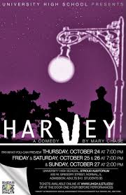
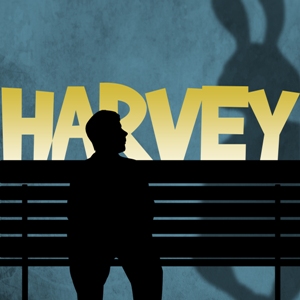
Each of the designers above seems to agree the key image has to feature Harvey in some shadow form. And many of these images feature Elwood too. Should we do something clever with the “H” the “R” or the “V” and the rabbit ears?
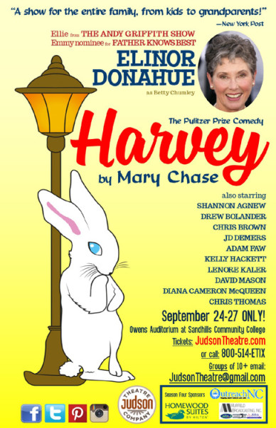
But wait: Harvey is a comedy–and we wanted that to be apparent to people who may not know the play. A dark palette would obfuscate that, so out went the idea of anything dark as the base color. We added the text “The Pulitzer Prize Comedy” along with the New York Post quote so right away people know Harvey is family-friendly, because not everything Judson Theatre Company has done in the past has been appropriate for all ages.
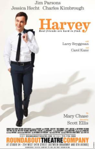
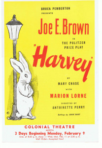
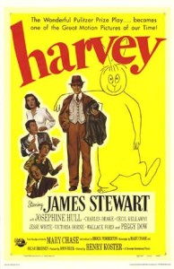
In a way, the story of this poster is…. there is no story. After searching for other logos, reading and re-reading the play for inspiration for something new, we took our designer’s ego out of the picture and went with what had proven effective in the past. We took our inspiration from the original artwork, with the film poster as a confirmation we were making the right choice–not because we couldn’t think of anything, but because that original art really can’t be beat.
It checked all the boxes:
–the title of the play jumps out.
–a happy palette…it’s a comedy.
–it’s beautiful and simple and it tells the story of the play, and more importantly, Harvey is pictured exactly as described in the text: “this great white rabbit leaning against a lamp-post.” He is not pictured as a shadow, but as Elwood sees him.
–the vintage font would indicate the period; we went back and forth quite a bit choosing between the brushed cursive of the play artwork and the bold type of the film’s title treatment, with the cursive winning out because we felt it was more evocative.
–the pull quote would tell people who didn’t already know the play that it’s a family-friendly show.
–Elinor’s name and face would let people know she’s our guest star, and The Andy Griffith Show credit is our North Carolina tie-in. Also, though we have our usual contingent of actors from New York, Hollywood, and Chicago, we also have several actors in Harvey who happen to have North Carolina ties, so we listed the names of the whole cast.
We didn’t just copy the original art though–we tweaked it a little for 2015: added the gradient, illustrated Harvey and the lamp-post in color, chose a more flowing font for the title of the play and used the brush-like font on the pull quote, tag and author’s name. But Harvey is Harvey is Harvey. It’s been beloved across the generations for a reason: three acclaimed runs on Broadway, an iconic character in Jimmy Stewart’s gallery of roles; three TV versions; and countless regional, stock, amateur, and school productions over the past 70 years. It’s an honor to be part of that. Won’t you join us for Harvey?