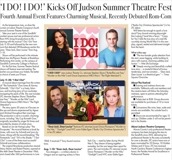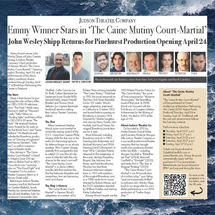
We’ve received so many positive comments about the Plaza Suite artwork, we thought it might be interesting to our readers to hear…The Story of a Poster.
A poster is hundreds of decisions: what is the key image for the show? what fonts? which photos of our stars? what is the tagline?
But first, we ask ourselves, what does a Plaza Suite poster need to convey at a glance? Make them stop and notice the poster and say, “Gee, that looks like fun—let’s go!” Beyond the obvious information that will be in the text (where to get tickets, etc.), we wanted the Plaza Suite poster to tell the viewer:
–who’s starring in the show
–it’s Neil Simon and it’s funny
–it’s set in the 1960s
–it’s set at the Plaza Hotel in New York – an elegant hotel
We knew we didn’t want to do what everyone else had done (Google search “Plaza Suite logo”): some predictable image of something hotel related, whether it be a room key, a door tag, a plaque—none of that seemed exciting or fun or bright enough.
For the image, we scoured books and the internet for classic images of The Plaza. Should we use a photo? A drawing? In color or black and white? We settled on a vintage-style illustration of the hotel that we pulled around a bit…we brightened it and made it more colorful and fun. It’s a comedy, after all.
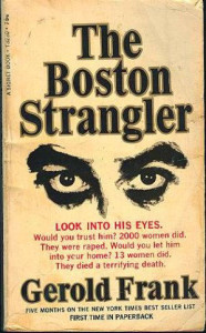
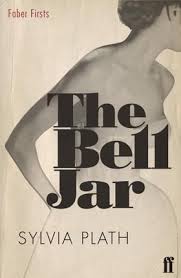

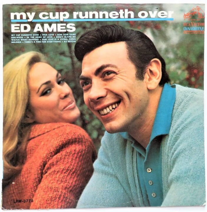
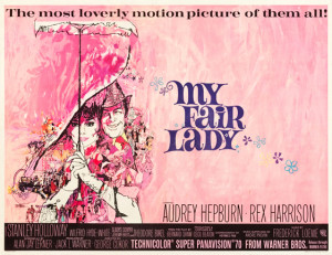
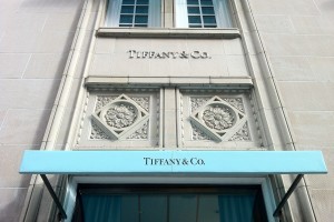
For the fonts, we looked at iconic 1960s book jackets and movie posters. But we were careful to send the message that the world of Plaza Suite is Establishment 1968, not Counterculture 1968. You can see similar text fonts to the one we chose on the jackets of iconic books of the period like Valley of the Dolls, The Boston Strangler, and The Bell Jar. And the font used for the play title is reminiscent of—but not an exact copy of—the title font from the massive mid-60s hit film version of My Fair Lady. Similarly, we chose the light blue accent color as a nod to The Plaza’s equally timeless Fifth Avenue neighbor, Tiffany and Co.
We wanted everyone to know about our pair of stars: Eve Plumb and Rex Smith, and chose gorgeous color photos of them.
Every poster has one thorny aspect that takes longer than the rest. For Plaza Suite it was the tagline. We wanted to convey a fun show that is bringing a bit of Broadway and classic New York to the Sandhills. Because of the stars we get, people often ask us if our shows are touring and Pinehurst is just a stop on the tour–but actually we rehearse and perform in Moore County and you can’t see our shows with our casts anywhere else. So check in and check out Plaza Suite—the happiest hotel in town!

