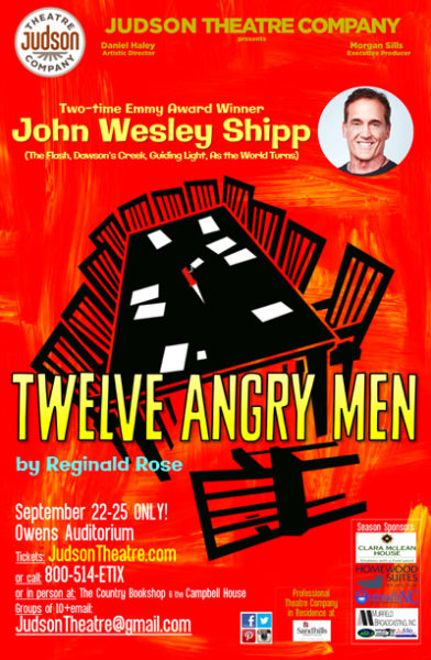
Now appearing in all the best shop windows in town (and on the fanciest walls), it’s time to write about the design process of our Twelve Angry Men poster. Thank you for all the positive feedback we’ve received for all the previous editions of The Story of a Poster.
Oddly, this one started with the background. Many other productions of the show use a plain red or red-and-white combination, but we chose a rather aggressive red-orange, knowing it’s an election year and there would probably be plenty of posters out there using red and white. But just solid red-orange wasn’t exciting enough. We stumbled on an image of a red-orange canvas with accents in yellow, and that became the background: the visible brush strokes added texture and a hint of force.
Then, it was font time. With our information font (bottom left) remaining constant now on all Judson posters, we had to choose a title treatment font and a billing font. This time, we knew we wanted the title in all caps. That meant the billing font should have an upper and lower case. To distinguish them further, we added gradient (going from cool to hot), outer outline, and subtle shadow to the title font, to give dimension and make the title jump out. We made the title lettering yellow to match the streaks in the painted background.
Big decision: digits, or the word? The multiple film and stage versions used both 12 Angry Men and Twelve Angry Men in their advertising. We found lots of logos for regional productions with a great big “12”. We looked at the first page of the script and the Broadway windowcard, where “Twelve” is spelled out. So that was that.
And then, the poster art: some plays we’ve done really only have one piece of iconography (in Harvey’s case, we knew there’d be a rabbit somewhere on the poster). Twelve Angry Men, on the other hand, had an abundance of iconography choices—even more than the number of hotel-related items we considered for Plaza Suite. Scales of justice. The knife. 12 men in silhouette. 12 slips of paper. We had an artist draw a period appropriate Saul Bass-ish illustration of chairs around a table, with one chair overturned, and included the knife and slips of paper that are part of the plot.
The tagline…notice there isn’t one on this poster. The play’s story is inherent in the title, so we decided against adding a tagline to the poster, which already has plenty of text. Although… some of the ad copy phrasing we’ve found, especially written in vintage style, has come in handy in other places: “twelve slips of paper—twelve chances to kill,” “life is in their hands, death is on their minds,” “explodes like twelve sticks of dynamite!”
So join us for Twelve Angry Men (click on BUY TICKETS here or above to get tickets). And let us know where you saw the poster!